
customizing.md 7.6 KB
How to customize ...
Customize a shortcut event
We will use a simple example to illustrate how to quickly add a shortcut event.
For example, typing _xxx_ will be converted into xxx.
Let's start with a blank document.
@override
Widget build(BuildContext context) {
  return Scaffold(
    body: Container(
      alignment: Alignment.topCenter,
      child: AppFlowyEditor(
        editorState: EditorState.empty(),
        keyEventHandlers: const [],
      ),
    ),
  );
}
At this point, nothing magic will happen after typing _xxx_.
Next, we will create a function to handle an underscore input.
import 'package:appflowy_editor/appflowy_editor.dart';
import 'package:flutter/material.dart';
import 'package:flutter/services.dart';

FlowyKeyEventHandler underscoreToItalicHandler = (editorState, event) {
  // Since we only need to handler the input of `underscore`.
  // All inputs except `underscore` will be ignored directly.
  if (event.logicalKey != LogicalKeyboardKey.underscore) {
    return KeyEventResult.ignored;
  }
};
Then, we need to determine if the currently selected node is TextNode and the selection is collapsed.
// ...
FlowyKeyEventHandler underscoreToItalicHandler = (editorState, event) {
  // ...

  // Obtaining the selection and selected nodes of the current document through `selectionService`.
  // And determine whether the selection is collapsed and whether the selected node is a text node.
  final selectionService = editorState.service.selectionService;
  final selection = selectionService.currentSelection.value;
  final textNodes = selectionService.currentSelectedNodes.whereType<TextNode>();
  if (selection == null || !selection.isSingle || textNodes.length != 1) {
    return KeyEventResult.ignored;
  }
Now, we start dealing with underscore.
Look for the position of the previous underscore and
- return, if not found.
- if found, the text wrapped in between two underscores will be displayed in italic.
// ...
FlowyKeyEventHandler underscoreToItalicHandler = (editorState, event) {
  // ...

  final textNode = textNodes.first;
  final text = textNode.toRawString();
  // Determine if `underscore` already exists in the text node
  final previousUnderscore = text.indexOf('_');
  if (previousUnderscore == -1) {
    return KeyEventResult.ignored;
  }

  // Delete the previous `underscore`,
  // update the style of the text surrounded by two underscores to `italic`,
  // and update the cursor position.
  TransactionBuilder(editorState)
    ..deleteText(textNode, previousUnderscore, 1)
    ..formatText(
      textNode,
      previousUnderscore,
      selection.end.offset - previousUnderscore - 1,
      {'italic': true},
    )
    ..afterSelection = Selection.collapsed(
      Position(path: textNode.path, offset: selection.end.offset - 1),
    )
    ..commit();

  return KeyEventResult.handled;
};
So far, the 'underscore handler' function is done and the only task left is to inject it into the AppFlowyEditor.
@override
Widget build(BuildContext context) {
  return Scaffold(
    body: Container(
      alignment: Alignment.topCenter,
      child: AppFlowyEditor(
        editorState: EditorState.empty(),
        keyEventHandlers: [
            underscoreToItalicHandler,
        ],
      ),
    ),
  );
}
[Complete code example]()
Customize a component
We will use a simple example to showcase how to quickly add a custom component.
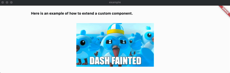
For example, we want to render an image from the network.
To start with, let's create an empty document by running commands as follows:
@override
Widget build(BuildContext context) {
  return Scaffold(
    body: Container(
      alignment: Alignment.topCenter,
      child: AppFlowyEditor(
        editorState: EditorState.empty(),
        keyEventHandlers: const [],
      ),
    ),
  );
}
Next, we choose a unique string for your custom node's type. We use network_image in this case. And we add network_image_src to the attributes to describe the link of the image.
For the definition of the [Node](), please refer to this [link]().
{
  "type": "network_image",
  "attributes": {
    "network_image_src": "https://docs.flutter.dev/assets/images/dash/dash-fainting.gif"
  }
}
Then, we create a class that inherits [NodeWidgetBuilder](). As shown in the autoprompt, we need to implement two functions:
- one returns a widget
- the other verifies the correctness of the [Node]().
import 'package:appflowy_editor/appflowy_editor.dart';
import 'package:flutter/material.dart';

class NetworkImageNodeWidgetBuilder extends NodeWidgetBuilder {
  @override
  Widget build(NodeWidgetContext<Node> context) {
    throw UnimplementedError();
  }

  @override
  NodeValidator<Node> get nodeValidator => throw UnimplementedError();
}
Now, let's implement a simple image widget based on Image.
It is important to note that the State of the returned Widget must be with [Selectable]().
For the definition of the [Selectable](), please refer to this [link]().
class _NetworkImageNodeWidget extends StatefulWidget {
  const _NetworkImageNodeWidget({
    Key? key,
    required this.node,
  }) : super(key: key);

  final Node node;

  @override
  State<_NetworkImageNodeWidget> createState() =>
      __NetworkImageNodeWidgetState();
}

class __NetworkImageNodeWidgetState extends State<_NetworkImageNodeWidget>
    with Selectable {
  RenderBox get _renderBox => context.findRenderObject() as RenderBox;

  @override
  Widget build(BuildContext context) {
    return Image.network(
      widget.node.attributes['network_image_src'],
      height: 200,
      loadingBuilder: (context, child, loadingProgress) =>
          loadingProgress == null ? child : const CircularProgressIndicator(),
    );
  }

  @override
  Position start() => Position(path: widget.node.path, offset: 0);

  @override
  Position end() => Position(path: widget.node.path, offset: 1);

  @override
  Position getPositionInOffset(Offset start) => end();

  @override
  List<Rect> getRectsInSelection(Selection selection) =>
      [Offset.zero & _renderBox.size];

  @override
  Selection getSelectionInRange(Offset start, Offset end) => Selection.single(
        path: widget.node.path,
        startOffset: 0,
        endOffset: 1,
      );

  @override
  Offset localToGlobal(Offset offset) => _renderBox.localToGlobal(offset);
}
Finally, we return _NetworkImageNodeWidget in the build function of NetworkImageNodeWidgetBuilder and register NetworkImageNodeWidgetBuilder into AppFlowyEditor.
class NetworkImageNodeWidgetBuilder extends NodeWidgetBuilder {
  @override
  Widget build(NodeWidgetContext<Node> context) {
    return _NetworkImageNodeWidget(
      key: context.node.key,
      node: context.node,
    );
  }

  @override
  NodeValidator<Node> get nodeValidator => (node) {
        return node.type == 'network_image' &&
            node.attributes['network_image_src'] is String;
      };
}
final editorState = EditorState(
  document: StateTree.empty()
    ..insert(
      [0],
      [
        TextNode.empty(),
        Node.fromJson({
          'type': 'network_image',
          'attributes': {
            'network_image_src':
                'https://docs.flutter.dev/assets/images/dash/dash-fainting.gif'
          }
        })
      ],
    ),
);
return AppFlowyEditor(
  editorState: editorState,
  customBuilders: {
    'network_image': NetworkImageNodeWidgetBuilder(),
  },
);
[Here you can check out the complete code file of this example]()